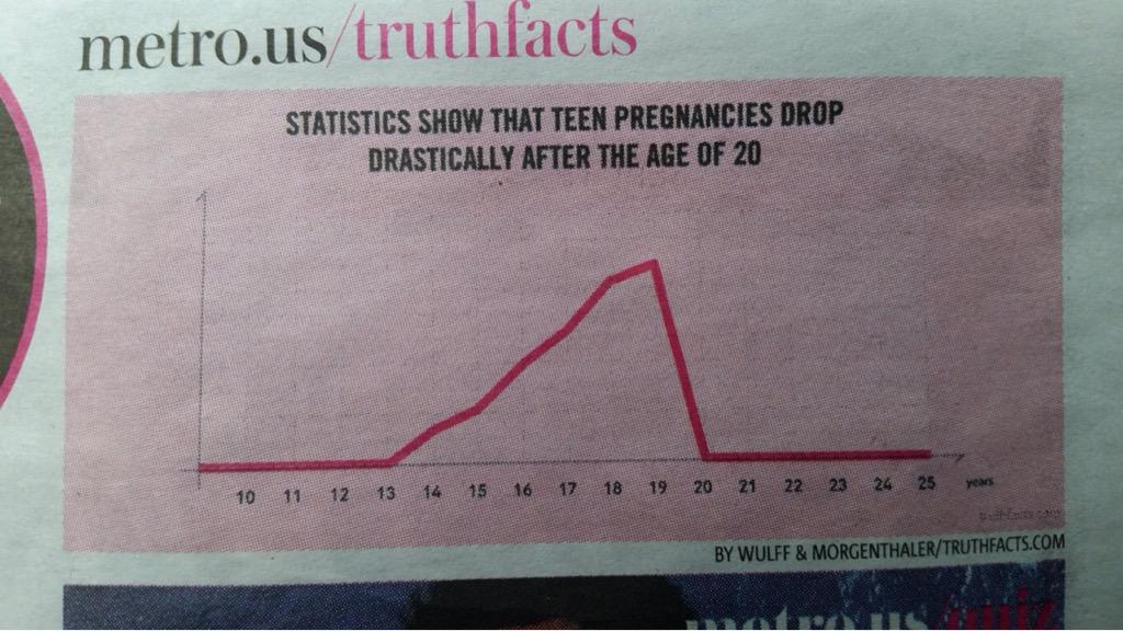
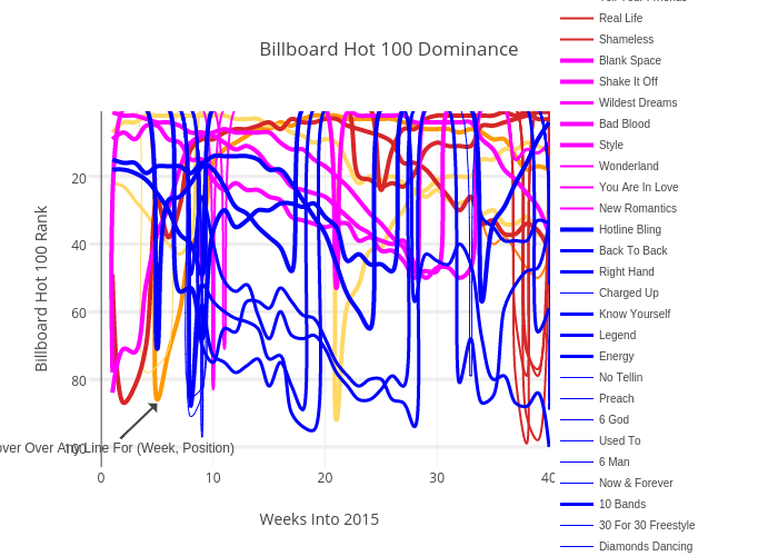
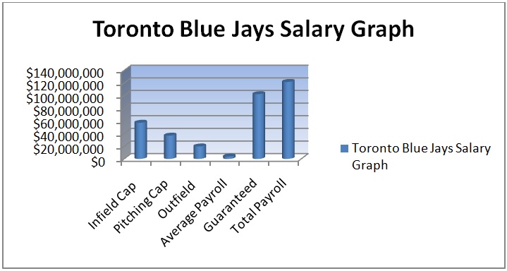
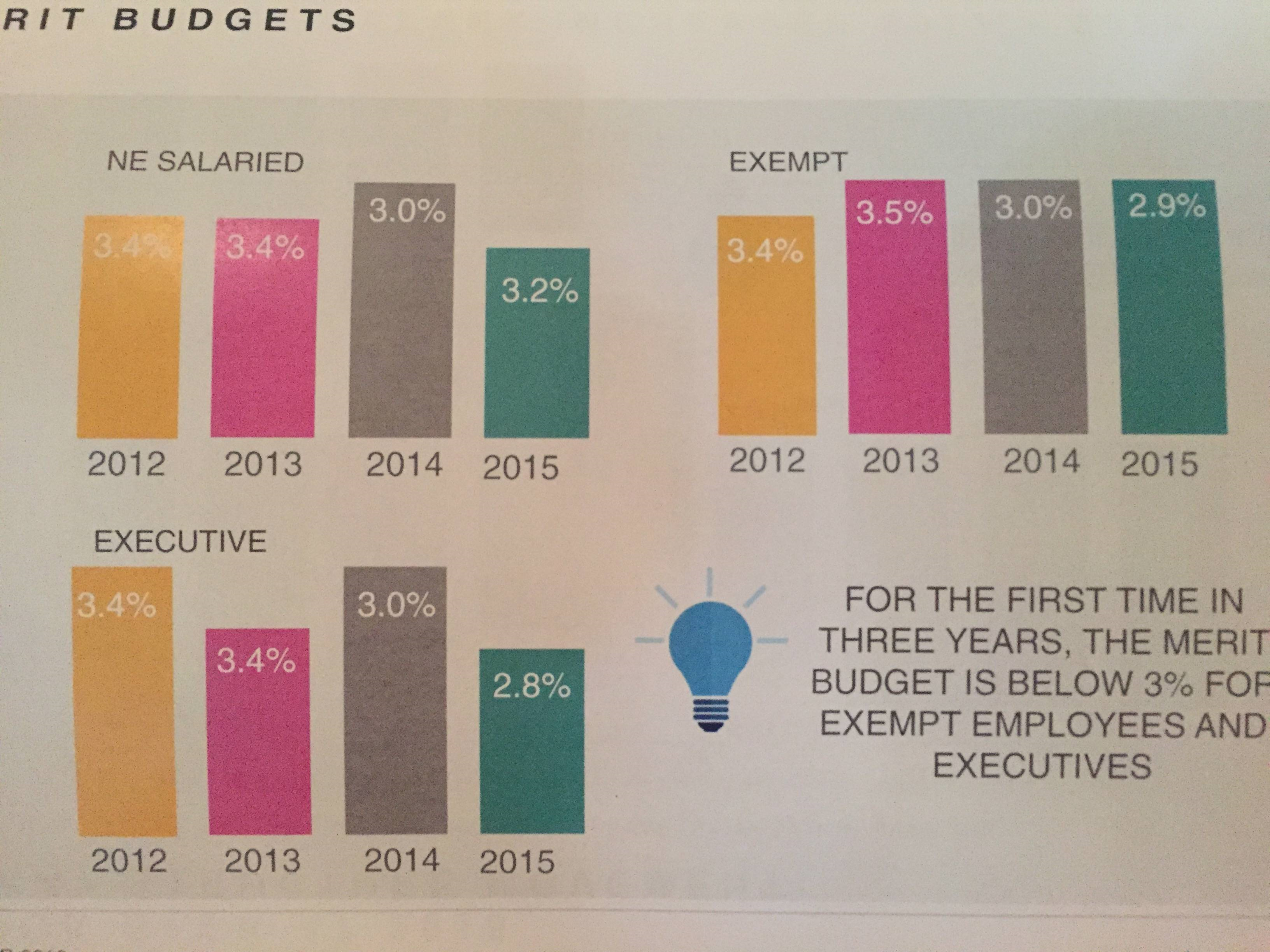
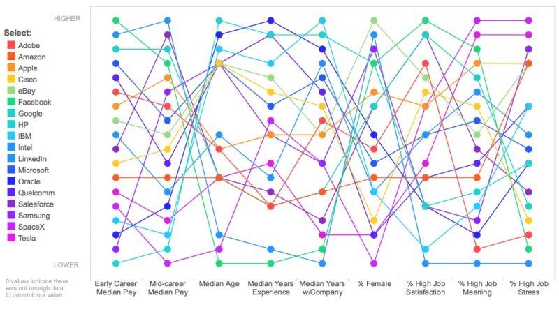
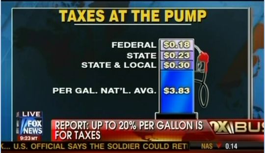
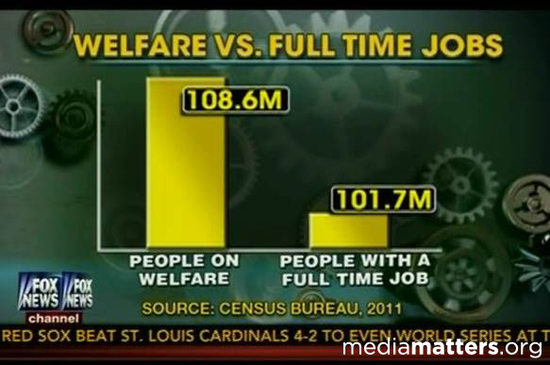
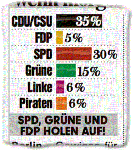
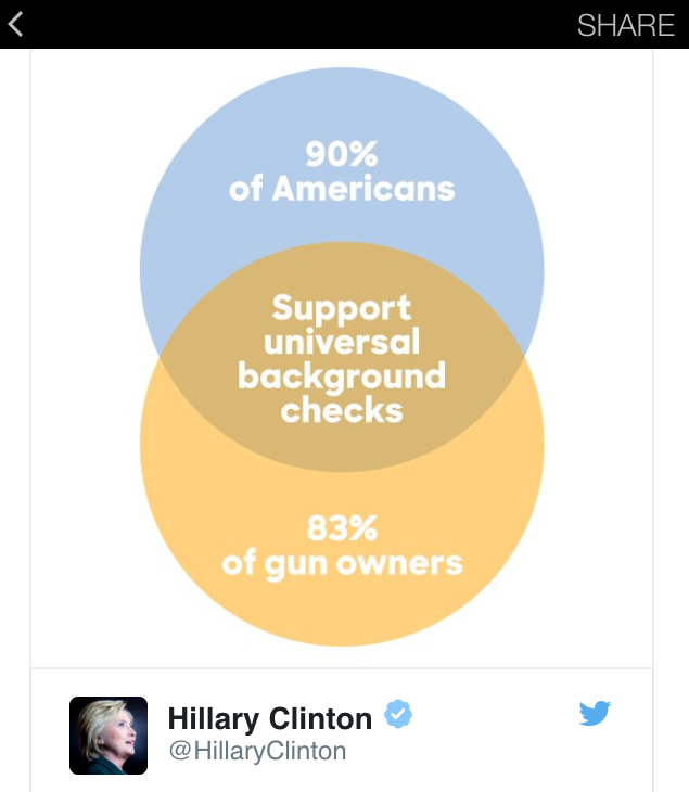
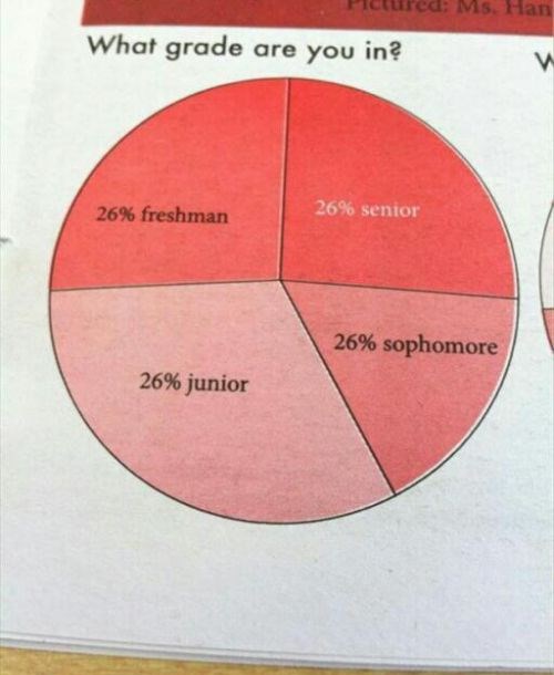
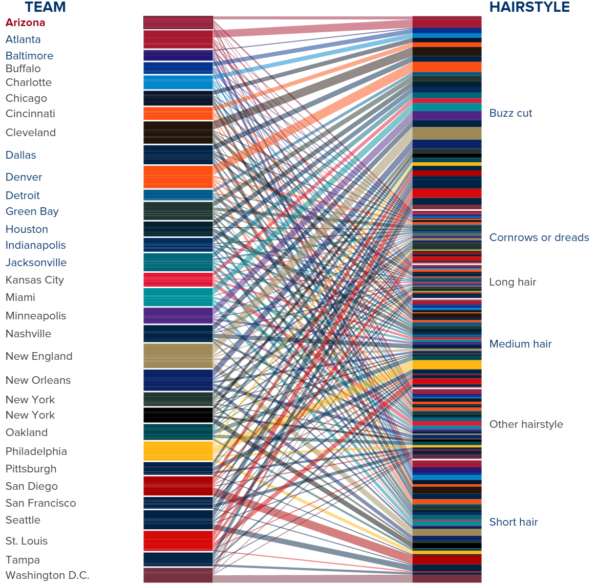
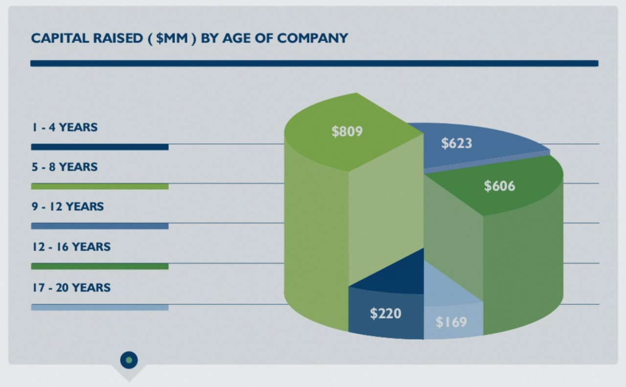
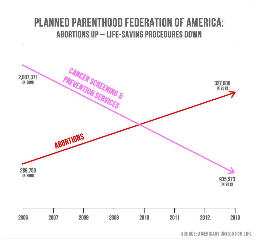
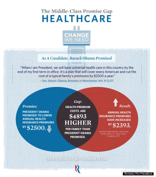
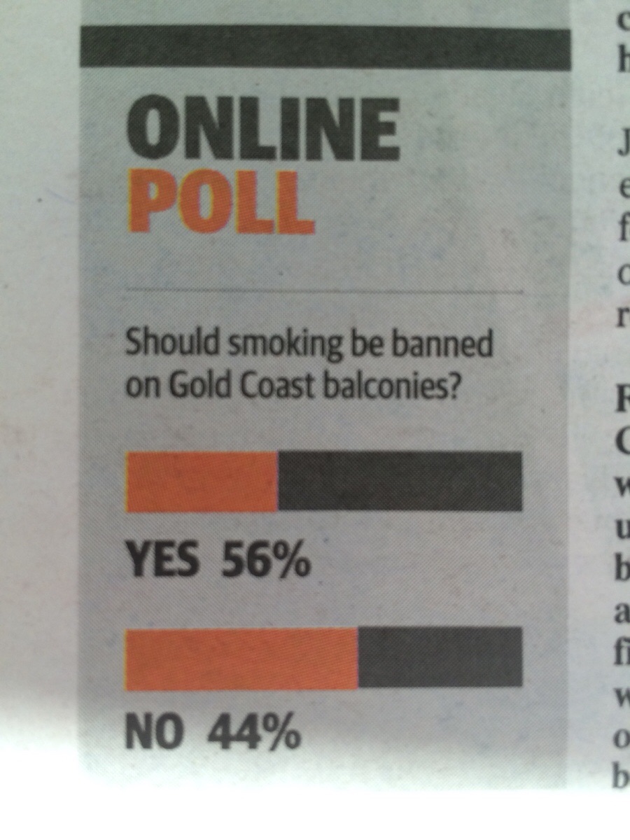
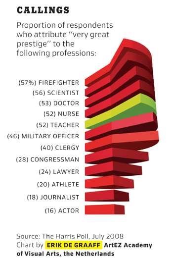
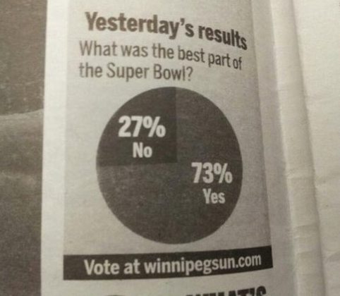
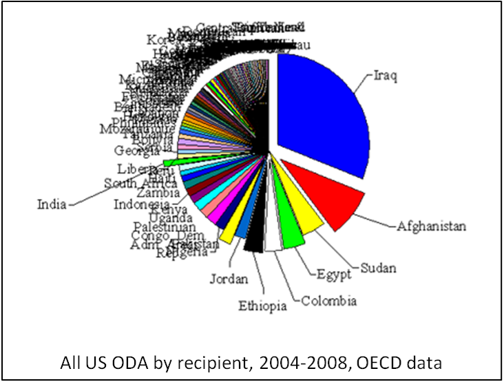
Bad Graph Wall of Shame

When choosing how to present statistics, it's important to do it well. Poor axes choices, choosing the wrong graph type for your data, bad or unclear labelling, and more can lead to a graph or chart which is, at best, not illuminating and at worst, misleading. The purpose of the visual presentation is to summarize the statistics of the data while being as clear as possible. The following graphs are presented as "What Not to Do".

Submit your own graph or chart to add to the Wall of Shame!

Teen Pregnancies
Some Countries
G+ Users
On-Ice Shooting
Banana Exports in Tons
Billboard Hot 100 Dominance
Blue Jays Salaries
Merit Budget Report
Median Career Pay
China's Water
Dental Anxiety
Federal Drug Control Budget
2016 GOP Primary Poll
Why We're Suing Gov. McCroy
Coffee Machine Bacteria
Gun Deaths in Florida
2012 GOP Primary Poll
Unemployment Rate
Gas Taxes
Obamacare Enrollment
Welfare vs Full-time Jobs
Proximal and Distal Fragments
Gun Background Checks
High School Graduation Rates
Grade in High School
Age of Death and Musical Genre
Percent Americans who have Tried Marijuana
Hairstyles in the NFL
Accidental Venn Diagram
Capital Raised by Age of Company
Planned Parenthood Abortions and Screenings
Rape Rates by Country
Healthcare Gap
Ticket Sales
Smoking Ban
Prestigious Careers
Best Part of the Superbowl
Most Feared by US Enemies
Velocity vs Length
US Aid Recipients


Contact Information
email: bcuchta@fairmontstate.edu or bcuchta@gmail.com
office: 423 Engineering Technology Building, Fairmont State University
View Brittany Cuchta's profile on LinkedIn

Valid CSS! HTML5 Powered with CSS3 / Styling, Device Access, and Semantics